Three templates you can press
Each of these is a finished template from the repository, running in the real viewer. A script in the page stands in for the application and plays the part its Go program plays on a PC. Below each one: what to try, the parts of its manifest worth reading, and where its source is.
Emberfall
A side panel for a dungeon crawler: health and mana globes, potions, four skills, a pet and the party. It is the example that looks least like a form, and it is built from the same eight components as the others.

A screenshot of Emberfall in the Android app. With JavaScript on, this frame runs the real viewer.
The application what it publishes, and what you send it
- Nothing yet. When the demo above is running, each change it publishes and each action you send appears here.
- Press a potion. The globe fills, the count on the button drops, and at zero the button fades and stops responding. It also makes a sound: that is the template's own feedback, played by the viewer.
- Press a skill. It costs mana and then cannot be used again until it has cooled down.
- Flip Cinder to town. Twenty seconds later the application flips it back and adds some gold: the switch always shows the application's state, not your last touch.
- Wait about a quarter of a minute. A boss appears and the whole layout changes.
The globes are a bar inside a stack
There is no globe component. Each globe is a bar whose track and fill are images, an empty globe and a full one, growing upwards. The viewer draws the full image clipped to the current level.
"hp": {
  "type": "bar",
  "value": { "bind": "hero.hp" },
  "max": { "bind": "hero.hpMax" },
  "style": {
    "direction": "up",
    "track": { "image": "assets/globe-empty.svg" },
    "fill": { "image": "assets/globe-health.svg" }
  }
}
The number in the middle and the glass highlight on top are separate components. A stack container gives all of them the same space and draws them back to front. The column of blank texts with weights is spacing: it pushes the value down to where the liquid is.
"hp": {
  "type": "stack",
  "children": [
    "hp",
    "hpGlass",
    {
      "type": "column",
      "children": [
        { "component": "blank", "weight": 9 },
        { "component": "hpValue", "weight": 5 },
        { "component": "hpMax", "weight": 3 },
        { "component": "blank", "weight": 8 }
      ]
    }
  ]
}
Two buttons, one action
Both potion buttons send drinkPotion; actionValue says which. The button is enabled only while there is a potion to drink, and its label shows how many are left. The feedback is the viewer's to play: it does not wait for the application.
"drinkHealth": {
  "type": "button",
  "icon": "assets/potion-health.svg",
  "label": { "format": "Health  {potions.health}" },
  "action": "drinkPotion",
  "actionValue": "health",
  "enabled": { "bind": "potions.health", "gt": 0 },
  "feedback": {
    "animation": "scaleDown",
    "sound": "assets/sounds/glug.wav",
    "haptic": "medium"
  },
  "style": {
    "background": { "image": "assets/plate.svg", "fit": "fill" },
    "padding": 1.5,
    "labelText": {
      "font": "bodyBold",
      "size": 3.6,
      "color": "#F1E4C8"
    }
  }
}
The boss fight is one value in state
The manifest has two scenarios, exploring and bossFight, and one line that chooses between them:
"scenario": { "bind": "mode" }When the application publishes "mode": "bossFight", the viewer swaps to the other layout, with the boss's name and health bar where the party heading was. Nothing is sent to say “switch”; the state simply says what is true.
Source
- The Emberfall template: its manifest, artwork, fonts and sounds.
- The Go program that drives it on a real server.
Rig
An instrument cluster for the machine itself: processor and graphics load, memory, network, the busiest processes, and controls for performance mode and fan speed. The readings here are simulated, as they are in the repository's demo program.
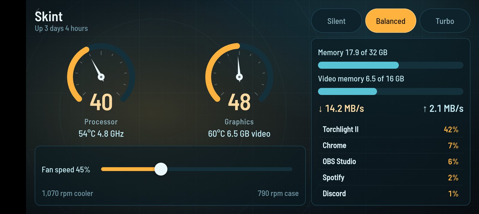
A screenshot of Rig in the Android app. With JavaScript on, this frame runs the real viewer.
The application what it publishes, and what you send it
- Nothing yet. When the demo above is running, each change it publishes and each action you send appears here.
- Press Silent, Balanced or Turbo. The application changes mode, moves the fan target with it, and the pressed button lights up.
- Drag the fan slider. The label and the fan speeds below follow, because the application publishes them.
- Choose Turbo, then drag the fan down to 20%. Over the next half minute the temperatures climb, and past about 80°C a dial turns red.
Dials turn red with variants
Nothing in style can be bound to state. Appearance that depends on state is a variant: extra style applied while a condition holds. Here the dial's fill and its number change colour while cpu.hot is true.
"cpu": {
  "type": "dial",
  "value": { "bind": "cpu.load" },
  "label": "Processor",
  "style": {
    "track": { "color": "#14303A" },
    "fill": { "color": "#FFB23E" },
    "needle": { "color": "#EAF7FA" },
    "valueText": { "font": "dial", "size": 11, "color": "#FFD9A0" },
    "labelText": {
      "font": "label",
      "size": 3.6,
      "color": "#8FB6C1"
    }
  },
  "variants": [
    {
      "when": { "bind": "cpu.hot" },
      "style": {
        "fill": { "color": "#FF5D4D" },
        "valueText": { "color": "#FFC2BB" }
      }
    }
  ]
}
The template does not decide what “hot” means. It cannot: bindings have no arithmetic. The application compares the temperature with its own threshold and publishes the answer as cpu.hot.
A row of buttons that behaves like a selector
The three mode buttons share the action setMode and differ only in actionValue. Each has a variant that lights it while mode equals its own value, so the row shows which is chosen without any component built for the purpose.
"modeTurbo": {
  "type": "button",
  "label": "Turbo",
  "action": "setMode",
  "actionValue": "turbo",
  "feedback": { "animation": "scaleDown", "haptic": "medium" },
  "style": {
    "background": { "color": "#0E222B" },
    "border": {
      "color": "#1F4350",
      "width": 0.3,
      "radius": "round"
    },
    "labelText": {
      "font": "label",
      "size": 3.8,
      "color": "#8FB6C1"
    }
  },
  "variants": [
    {
      "when": { "bind": "mode", "eq": "turbo" },
      "style": {
        "background": { "color": "#FF5D4D" },
        "border": { "color": "#FFA59B" },
        "labelText": { "color": "#22060A" }
      }
    }
  ]
}
The slider asks; the application answers
The slider shows fans.target from state and sends setFanTarget with the value you drag to. The application clamps it and publishes the new target, and the text beside it is a format string over the same state.
"fanTarget": {
  "type": "slider",
  "value": { "bind": "fans.target" },
  "min": 20,
  "max": 100,
  "step": 5,
  "label": { "format": "Fan speed   {fans.target:.0}%" },
  "action": "setFanTarget",
  "feedback": { "haptic": "light" },
  "style": {
    "track": { "color": "#14303A" },
    "fill": { "color": "#FFB23E" },
    "thumb": { "color": "#EAF7FA" },
    "labelText": {
      "font": "label",
      "size": 3.8,
      "color": "#BFE9F2",
      "align": "start"
    }
  }
}
Source
- The Rig template: its manifest, background and fonts.
- The Go program that drives it, with simulated readings.
Marquee
A companion for a media player: what is playing, how far through it is, who is on screen in this scene, and a remote. The films are invented and run at forty times normal speed here, so that scenes change while you watch.
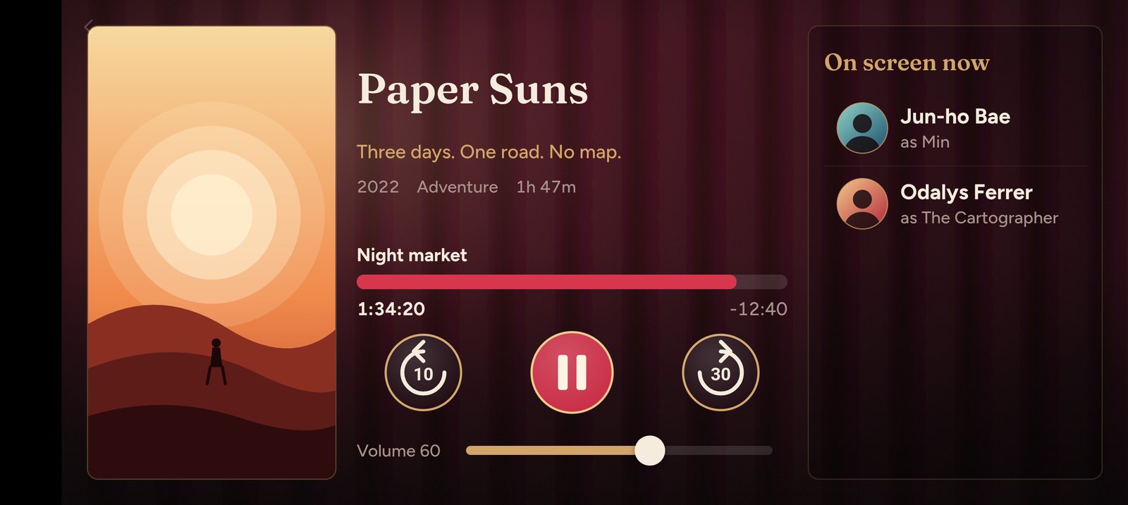
A screenshot of Marquee in the Android app. With JavaScript on, this frame runs the real viewer.
The application what it publishes, and what you send it
- Nothing yet. When the demo above is running, each change it publishes and each action you send appears here.
- Press pause, then play. They are two buttons in the same place; only one is visible at a time.
- Drag the volume. Skip forward thirty seconds a few times.
- Press a name in On screen now. The row sends an action carrying that person's ID, which you can see arrive below the phone.
- Watch for a couple of minutes: the cast list changes with each scene, and when the film ends the next one starts with a different poster.
The poster is a runtime asset
A media player cannot ship every poster inside its template. So the poster is an image bound to state, with a packaged placeholder for when nothing is playing:
"poster": {
  "type": "image",
  "src": { "bind": "media.poster", "default": "assets/poster-idle.svg" },
  "style": {
    "fit": "cover",
    "border": { "color": "#D2A56B55", "width": 0.3, "radius": 2.2 }
  }
}
When a film starts, the application uploads its poster to the server while connected, then points state at it with a runtime: reference. In outline, the Go program does this:
app.UploadAsset("posters/lantern.svg", "image/svg+xml", data)

app.Patch(map[string]any{
	"media": map[string]any{"poster": "runtime:posters/lantern.svg"},
})
The viewer fetches the image from the server, and from nowhere else. In this page's demo there is no server, so the demo script hands the viewer the same two poster files directly.
A list whose rows can be pressed
A list draws one row per element of an array in state. Inside item, a path starting $item. reads from the row's own element. Because the list has an action, its rows can be pressed, and actionValue picks what is sent: here the person's id rather than the row number. The list has the ID onScreen and no items property, so it shows the state key onScreen.
"onScreen": {
  "type": "list",
  "item": {
    "image": { "bind": "$item.photo" },
    "title": { "bind": "$item.actor" },
    "subtitle": { "format": "as {$item.character}" }
  },
  "action": "showPerson",
  "actionValue": { "bind": "$item.id" },
  "feedback": { "haptic": "light" },
  "style": {
    "rowHeight": 15,
    "divider": { "color": "#FFFFFF12" },
    "titleText": {
      "font": "textBold",
      "size": 4.2,
      "color": "#F6ECDD",
      "align": "start"
    },
    "subtitleText": {
      "font": "text",
      "size": 3.4,
      "color": "#A8918A",
      "align": "start"
    }
  }
}
Play and pause share a space
The two buttons sit in a stack, each with a visible condition on media.playing, one of them inverted with not. Both send setPlaying, with true or false.
"play": {
  "type": "button",
  "icon": "assets/play.svg",
  "style": { "background": { "color": "#00000000" } },
  "action": "setPlaying",
  "actionValue": true,
  "visible": { "bind": "media.playing", "not": true },
  "feedback": { "animation": "pulse", "haptic": "medium" }
}"pause": {
"type": "button",
"icon": "assets/pause.svg",
"style": { "background": { "color": "#00000000" } },
"action": "setPlaying",
"actionValue": false,
"visible": { "bind": "media.playing" },
"feedback": { "animation": "pulse", "haptic": "medium" }
}Source
- The Marquee template: its manifest, artwork and fonts.
- The Go program that drives it, and the posters it uploads.
Make one of your own
All three templates are plain folders: a manifest.json and an assets directory. Copying one and changing it is a reasonable way to start. The tutorial builds a small one from nothing, and the schema reference has every component and style key.
To run these three against a real server and a real phone, the repository's README has the commands.